Good Doctor – Workbench Enhancement
Improving speed, structure, and safety for doctors using Good Doctor’s internal platform, built through research, co-design, and validation.
Role
Senior Product Designer
Industry
HealthTech / Telemedicine
Duration
2 Months
The Problem
In 2020, Good Doctor needed to scale internal consultations quickly. But doctors faced an inefficient and cluttered workbench UI. They struggled with:
Slow, multi-tab consultations
Inconsistent diagnosis input
Unclear prescription fields
Missed patient messages
Pain Points from Doctor Interviews:
Patient info wasn’t visible during long scrolls
Drug input was confusing and disconnected from stock availability
ICDX diagnosis input only worked with keyboard
Frequent context-switching (Excel, Google, etc.)
Alert fatigue: hard to notice incoming patients or unread chat
“I open 3 tabs and still feel unsure if I missed something.”
– Internal Doctor, Good Doctor
Internal Survey Data:
85% of doctors needed 6+ minutes to send a single prescription
50% found the visual design “hard to use”
32% said the Workbench was “not visually appealing”
19% felt it lacked key features for daily use
Qualitative Themes:
“Hard to tell if a message was missed”
“Feels like too many steps for a simple flu case”
“I worry I’ll prescribe something wrong by mistake”
Our Process: Design Sprint
We used a sprint-inspired 6-phase process to break down, explore, and rebuild the Workbench experience.
Phase 1 – Understand
We interviewed internal doctors (dr. Adhiatma, dr. Elizabeth, dr. Ega) and analyzed logs from 34+ users. Key challenges:
Patient data not visible during long scrolls
Chat input and diagnosis fields unclear
Doctors missed queues or patient messages due to poor alerts
ICD X system didn’t support quick diagnosis input (only keyboard-based)
We organized the problem around three core challenges:
Efficiency in consultations
Scalability in queue and prescription handling
Reliability of drug and diagnosis entry
Phase 2 – Define
We mapped the full Doctor Journey across:
Opening clinic
Attending patient queue
Viewing health files
Entering complaints & diagnoses
Sending prescriptions
Each step revealed UX friction and emotional stress:
Frustration from diagnosis errors
Overload during multitasking
Uncertainty in medication availability
We then created 3 doctor personas and reframed the redesign with real pain points and expectations.
Phase 3 – Sketch
We divided our focus into 3 main areas:
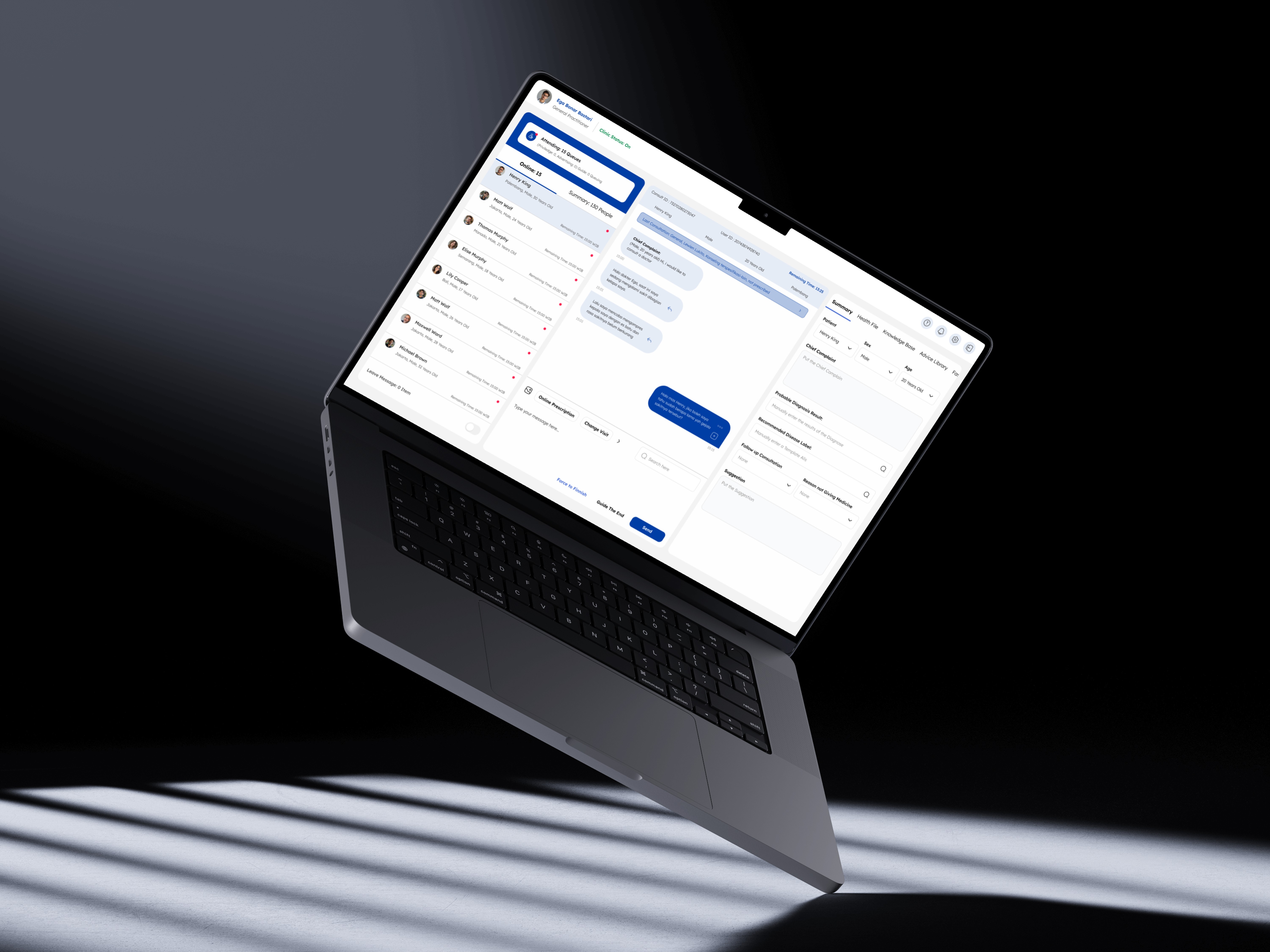
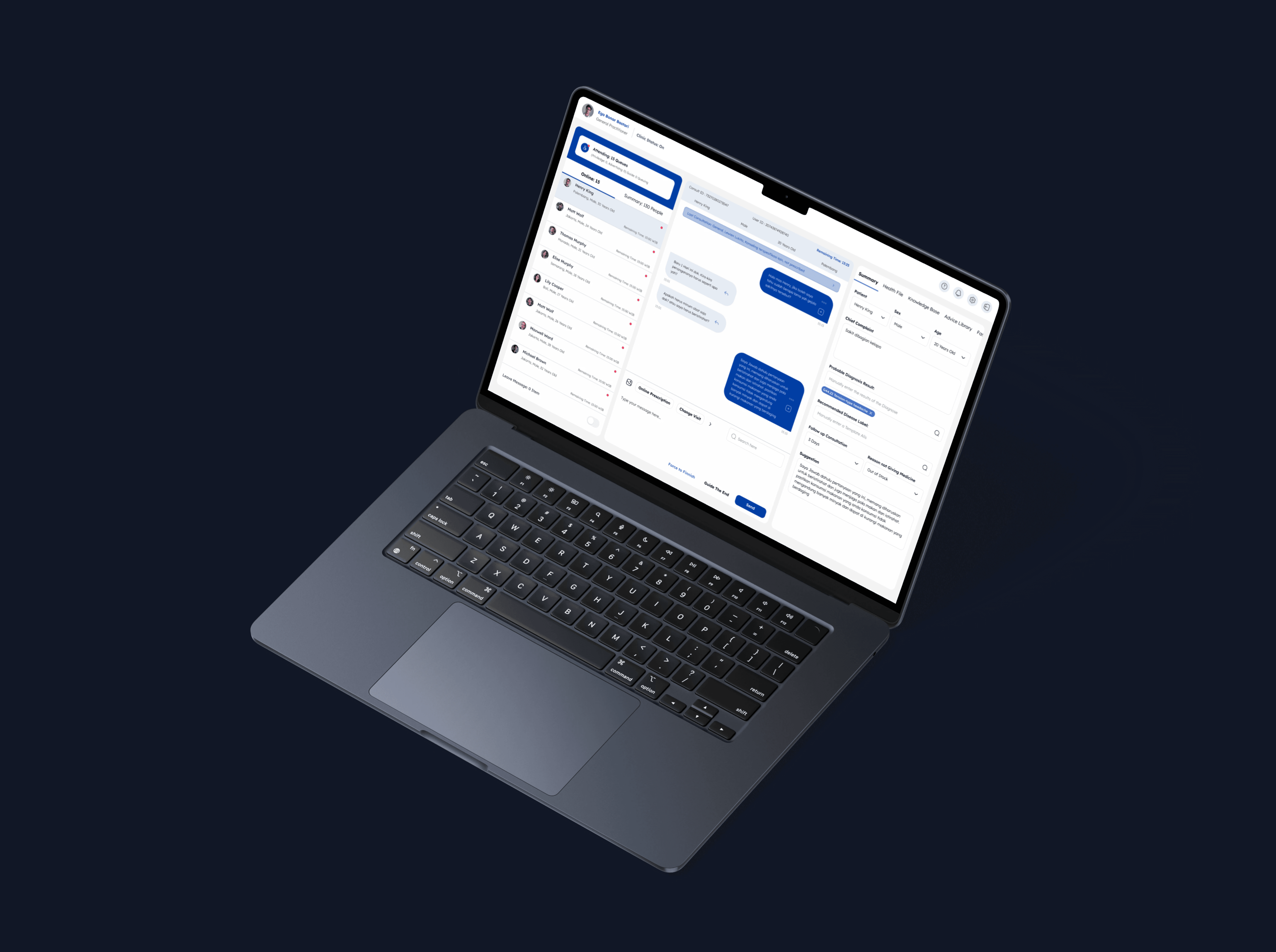
Patient Queue & Info Panel
Consultation & Diagnosis Flow
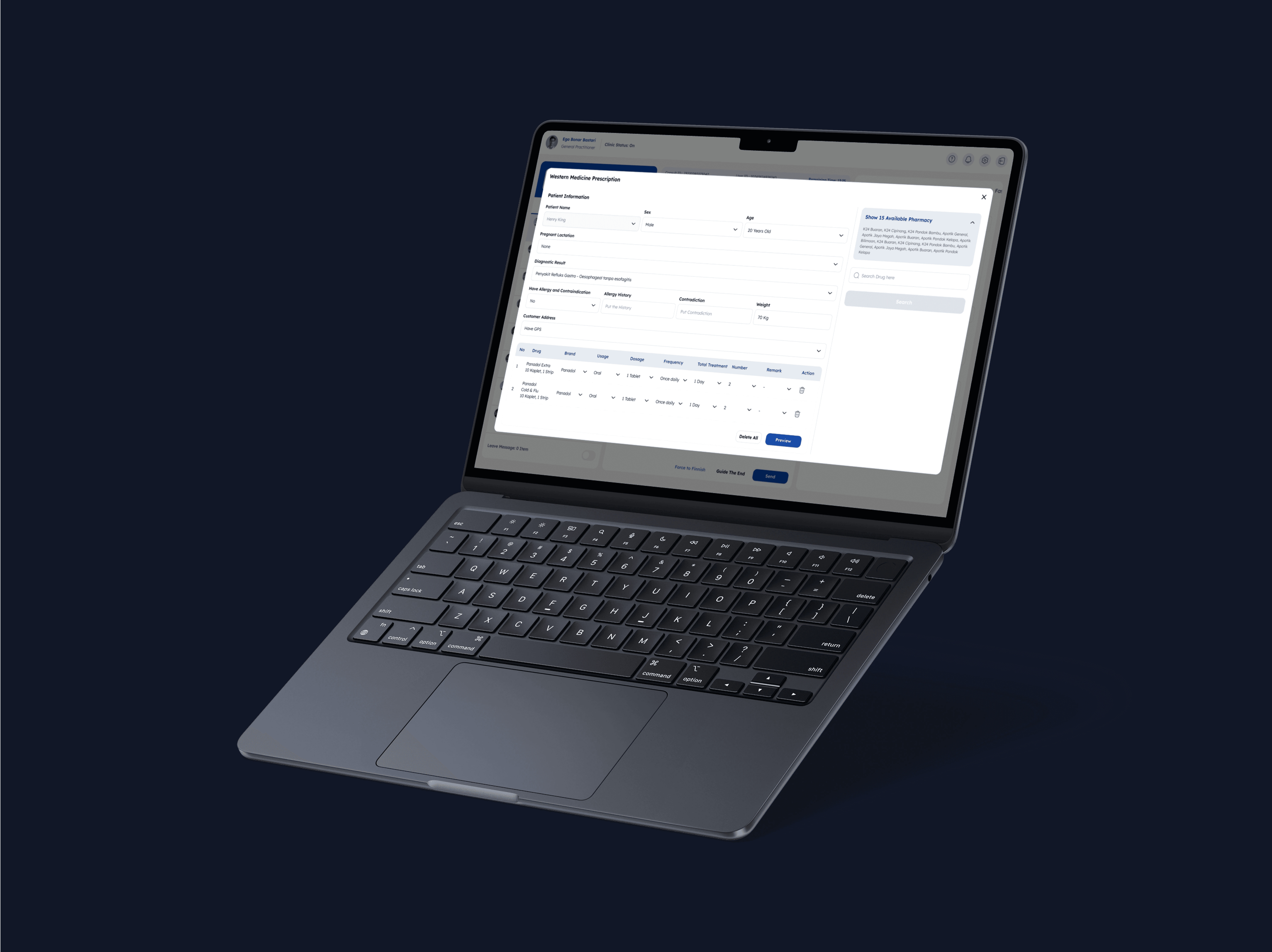
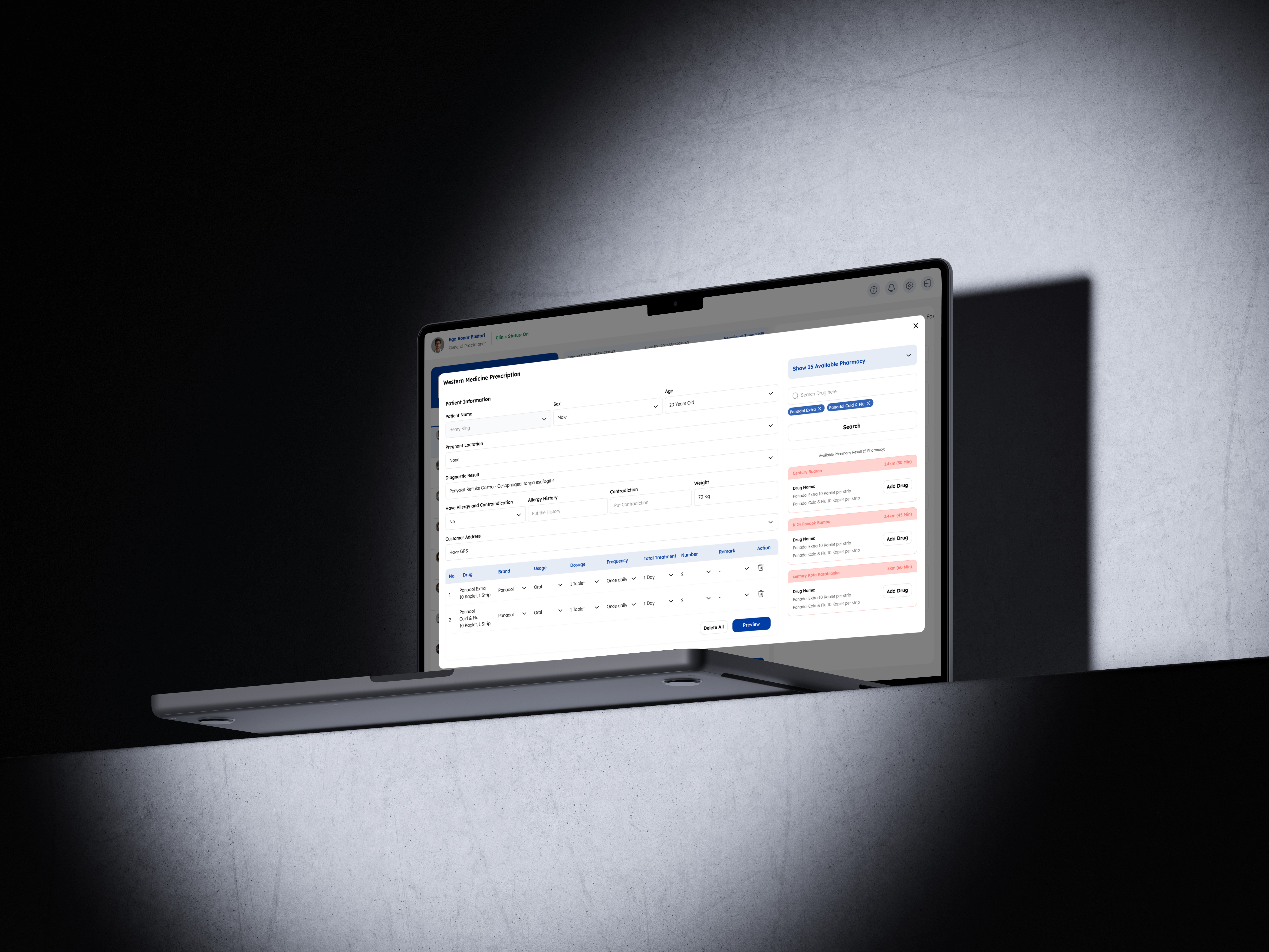
Prescription Entry & Drug Lookup
Doctors co-sketch with us using whiteboards and live feedback. Ideas included:
Sticky patient info headers
Real-time “queue alert” badge
Auto-fill ICDX with mouse click
Better separation of input fields for allergy, diagnosis, and usage
Phase 4 – Decide
We voted based on technical feasibility and user impact, then storyboarded:
New layout for sticky patient profile during scroll
Smart auto-complete for ICD X input (clickable, not keyboard-only)
Drug search that filters results based on active pharmacy inventory
Inline diagnosis tagging that updates fast reply templates
Phase 5 – Prototype
We built a low-fidelity interactive prototype using Figma and Overflow, simulating:
Full consultation from queue → diagnosis → prescription
Sticky header, real-time notification, and simplified fields
Inline prescription without pop-ups
Phase 6 – Validate
We tested with 5 internal doctors in real scenarios:
Prescribing for fever, cold, and pregnancy cases
Entering complaints and tags
Managing queues while responding in chat
Feedback Summary:
100% said the new layout felt more structured
60% completed prescriptions in under 4 minutes
All users preferred mouse + type input for ICDX over keyboard-only
Drug stock visibility during prescription saved 2–3 minutes per session
UX Strategy & IA
We designed with 3 goals:
Reduce errors by clarifying structure
Support mental flow of clinicians under time pressure
Make queue and drug data more visible upfront
UX Principles
Principle | Workbench Dashboard |
|---|---|
Clarity First | Each ste, from complaint to prescription, is clearly divided and labeled |
Minimize Redundancy | Allergy fields default to "None", eliminating 4+ clicks per session |
Enable Speed with Control | Mouse-based ICDX input + smart templates reduced typing burden |
Context Always Visible | Patient photo, complaint, and chat stay visible during scroll |
Real-Time Feedback | Queue alerts and read receipts inspired by messaging tools |
Results
Metric | Before | After |
|---|---|---|
Avg. consultation time | 6–9 mins | 4–6 mins (↓32%) |
UI-related support tickets | 26 in 2 weeks | 10 in 2 weeks (↓62%) |
Avg. prescription misclicks | 2.4 per day | <1 per day |
Doctor satisfaction (post-test) | N/A | 4.6/5 avg. rating |
“Feels more like how I work in a real clinic.” – Doctor Ega
Reflection
Designing tools for healthcare is not about flashy UI. It’s about creating a quiet, reliable space for life-saving decisions.
I learned that:
Structure is safety in medical UX
Co-designing with users builds better adoption and deeper empathy
Every small improvement (1 click, 1 label) adds up at scale
This project helped me grow as a designer — not just to build usable flows, but to remove uncertainty from critical environments.
Other projects
Setlary App – Early Wage Access (EWA)
Improving speed, structure, and safety for doctors using Good Doctor’s internal platform, built through research, co-design, and validation.
Virgo – Enhance Liveness Verification
Improving speed, structure, and safety for doctors using Good Doctor’s internal platform, built through research, co-design, and validation.
Virgo – New Device Notification
Improving speed, structure, and safety for doctors using Good Doctor’s internal platform, built through research, co-design, and validation.
Digital Banking Sharia: Aladin Bank
Improving speed, structure, and safety for doctors using Good Doctor’s internal platform, built through research, co-design, and validation.