Virgo – Enhance Liveness Verification
Improving identity verification through clear guidance, reduced errors, and a smarter, user-friendly flow.
Role
Lead Product Designer
Industry
Financial Service
Duration
2 Weeks
Background & Problem
To combat fraud and false identity risks during account creation, we needed to confirm that users were real people, not just submitting static or manipulated photos.
Key issues we uncovered:
Users wearing masks/hats resulted in 70–79% face match accuracy, a major drop from acceptable standards.
Competitors faced similar challenges, especially during pandemic-driven remote onboarding.
Our instruction pages lacked clarity and consistency, reducing user confidence and success rate.
Goal
Improve the KYC (Know Your Customer) process by integrating and enhancing Liveness Verification, ensuring real users can be verified quickly, securely, and confidently.
Benchmark & Competitive Insights
We studied the KYC flows of key fintech players:
GoPay, OVO, DANA, LinkAja, ShopeePay
Each varied in duration and steps, but:
✅ GoPay’s 3-step flow stood out as efficient and user-friendly.
✅ Clear visual guidance and progressive disclosure helped improve completion.
❌ Some flows were long (up to 3.5 min), with unnecessary data entry.
Takeaway: We adopted a streamlined GoPay-style flow, eKTP scan, liveness check, and confirmation, while minimizing manual input fields.
Design Process
We designed two versions of the instruction flow, improving clarity, consistency, and security reassurance:
Used clearer illustrations with “Do & Don'ts”
Revised orange color usage for better readability
Added labels like “Verifikasi” to improve system feedback
Phase 1: included selfie
Phase 2: removed selfie, used AAI tech stack
(AAI: OCR, Liveness, Face Match, Privy integration)
User Testing
Conducted with 33 internal employees using Maze prototype
Key Missions Tested:
Finding the verification entry point
Completing the verification process
Understanding instructions
Comparing instruction page designs
Highlights:
✅ 81.8% used the expected flow path
✅ 25/28 understood instruction pages clearly (avg. 7 sec reading time)
🔄 Minor confusion on UI elements like square face-frame
🎯 Users preferred Design 2 for its sense of responsiveness
🔧 Final page needs clearer copy like “Verifikasi data terkirim”
Outcome & Impact
Instruction screens became more intuitive and reassuring
Visuals and colors helped reduce friction during onboarding
Flow time reduced while maintaining clarity and compliance
Key feedback around accessibility (e.g., glasses) is noted for future

Reflection
This project highlighted how much trust and clarity matter in verification UX. Liveness checks aren’t just technical, they are emotional touchpoints where users ask: “Will I be accepted?”
By grounding our decisions in real benchmarks and user feedback, we made the Virgo onboarding feel faster, safer, and more human.
Other projects
Setlary App – Early Wage Access (EWA)
Improving speed, structure, and safety for doctors using Good Doctor’s internal platform, built through research, co-design, and validation.
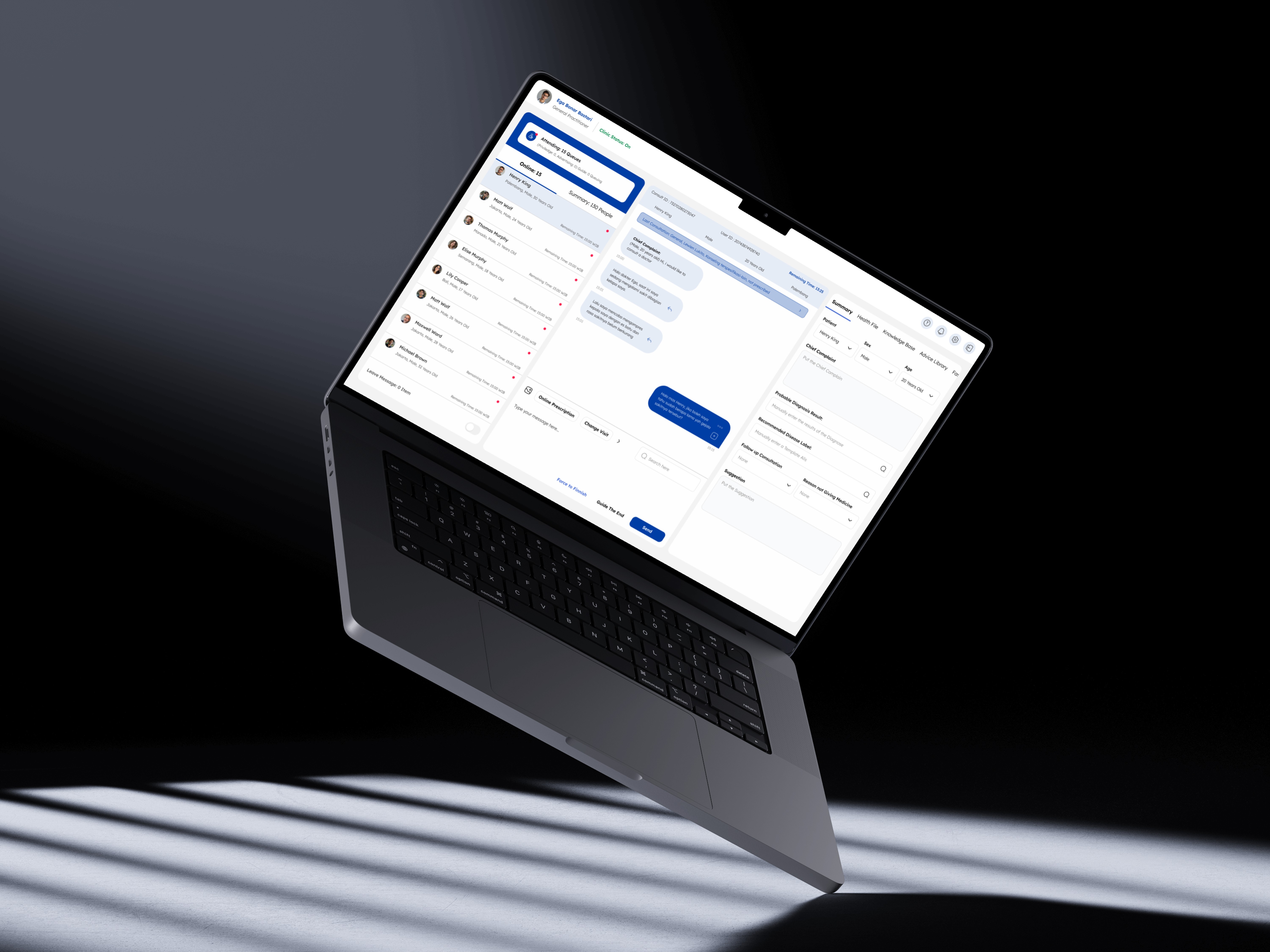
Good Doctor – Workbench Enhancement
Improving speed, structure, and safety for doctors using Good Doctor’s internal platform, built through research, co-design, and validation.
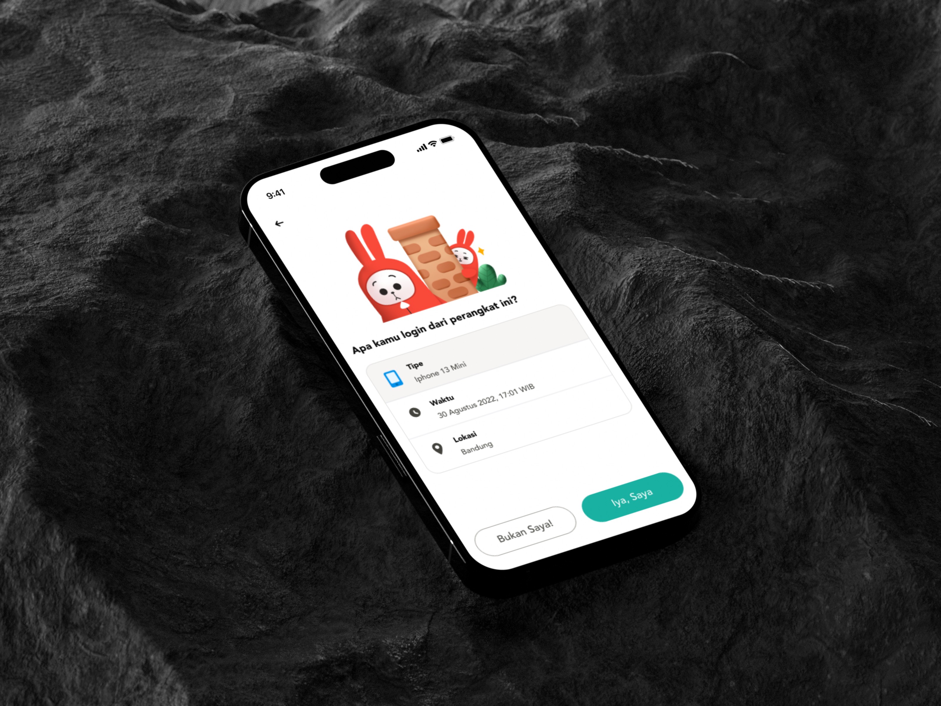
Virgo – New Device Notification
Improving speed, structure, and safety for doctors using Good Doctor’s internal platform, built through research, co-design, and validation.
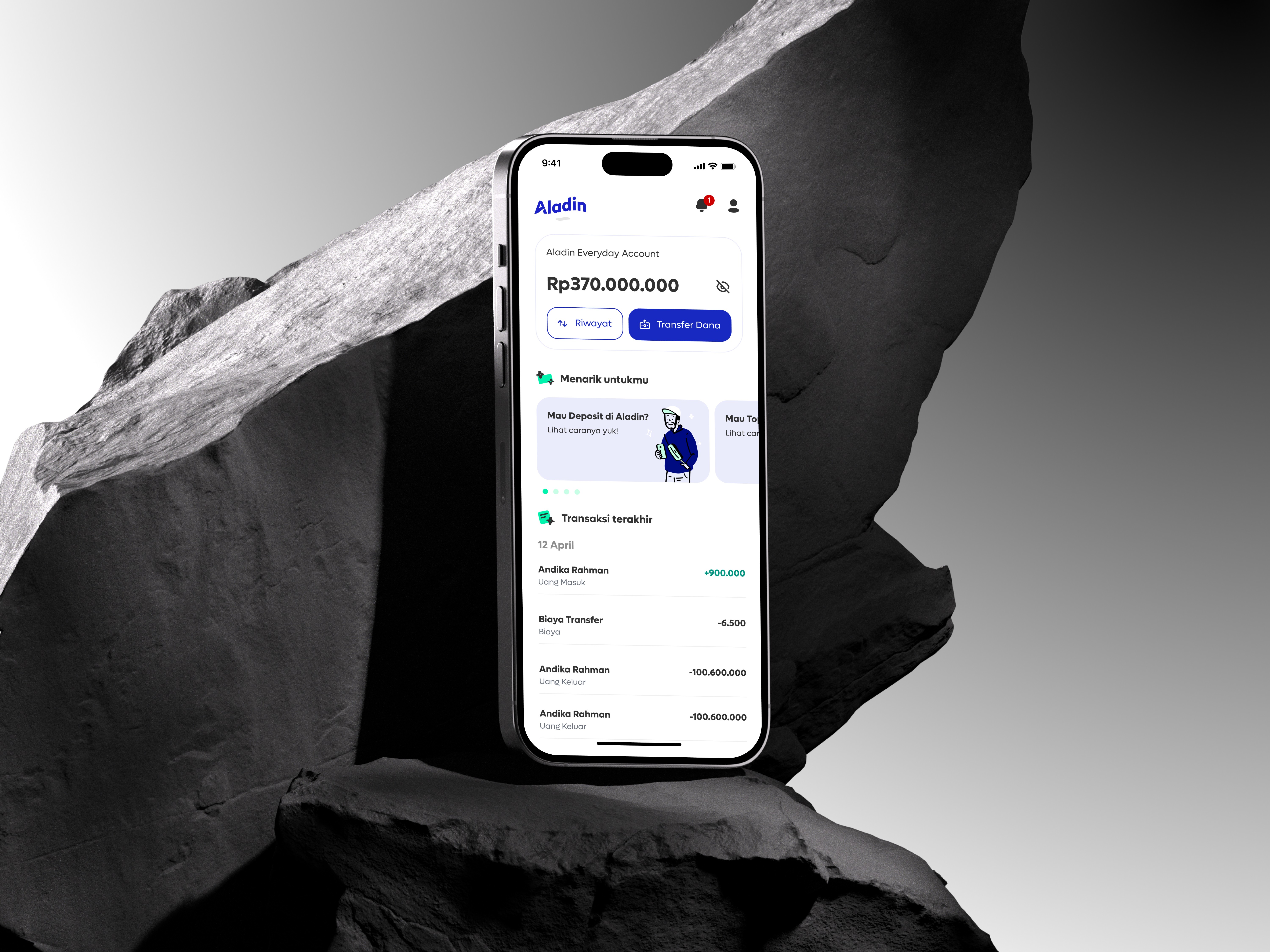
Digital Banking Sharia: Aladin Bank
Improving speed, structure, and safety for doctors using Good Doctor’s internal platform, built through research, co-design, and validation.